Improving Student Support at Australian Catholic University
A UX research and product design initiative to transform how students interact with customer service—online and on campus
The Challenge
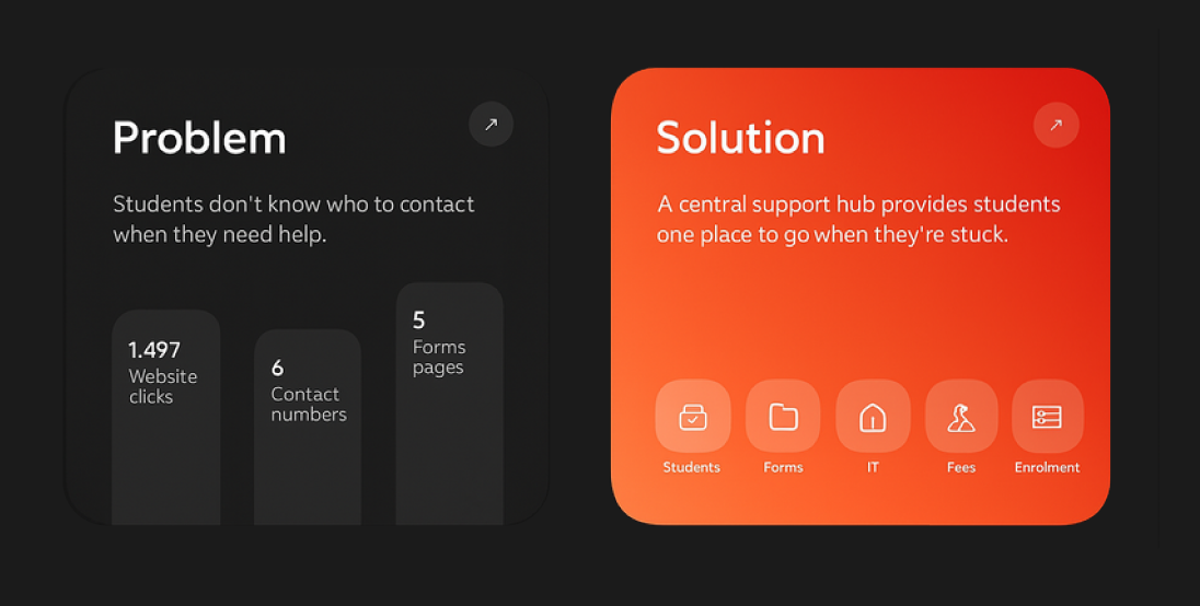
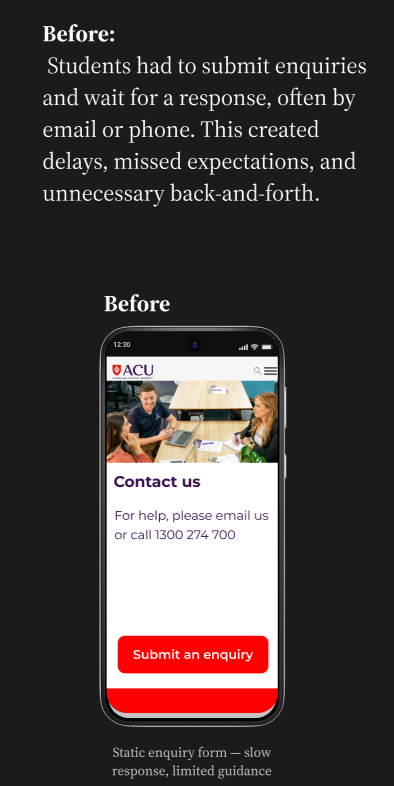
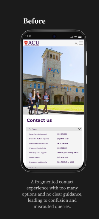
A Fragmented Support Experience
Students looking for help were confronted with a maze of outdated forms, multiple phone numbers, and confusing navigation. Responses were inconsistent and the overall service felt disconnected.
Students looking for help were confronted with a maze of outdated forms, multiple phone numbers, and confusing navigation. Responses were inconsistent and the overall service felt disconnected.
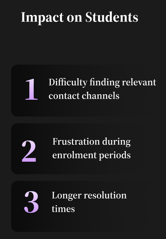

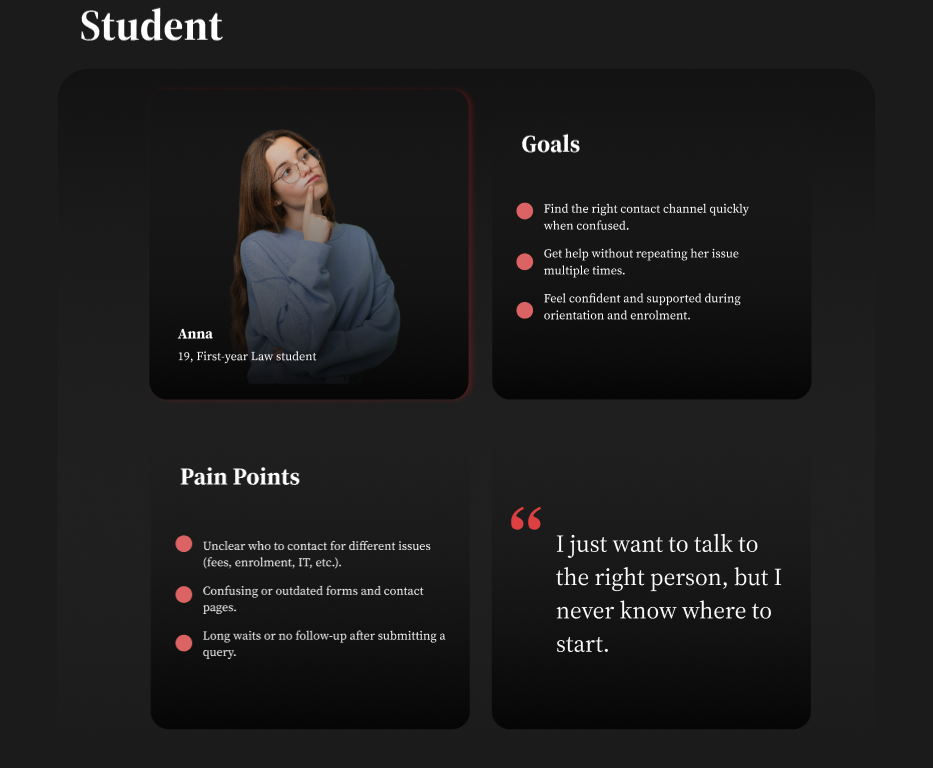
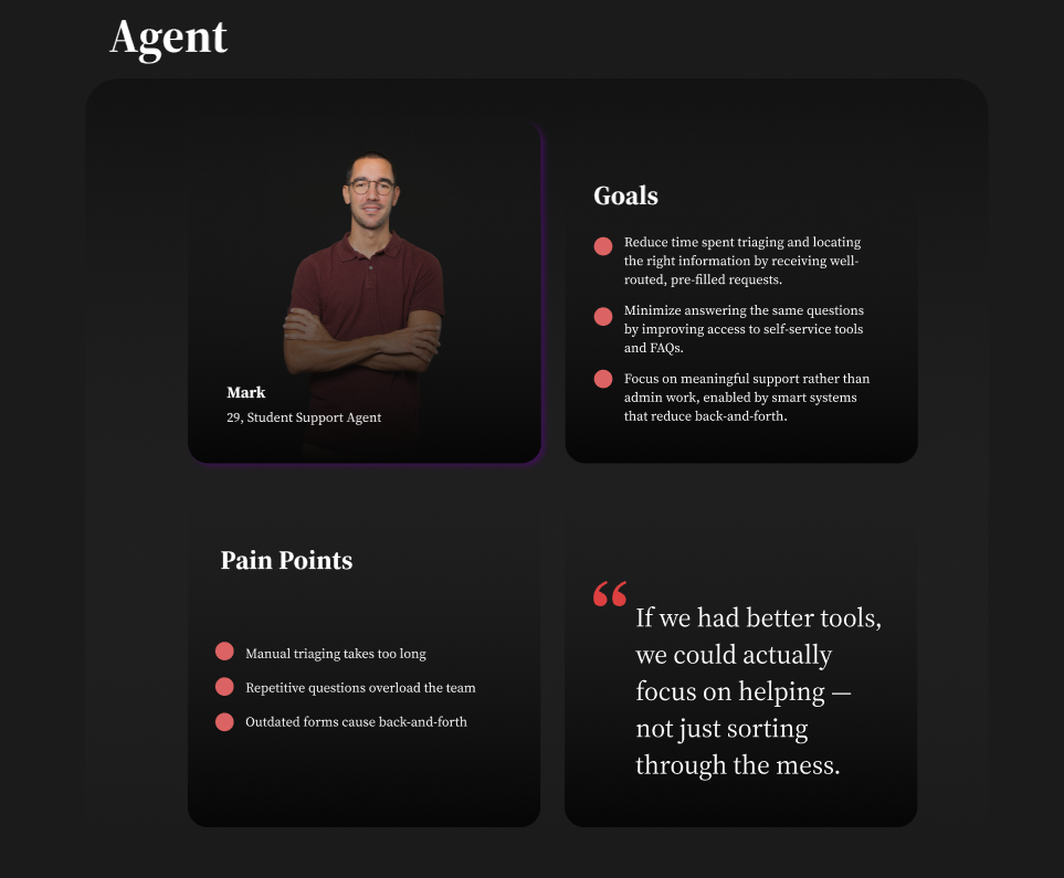
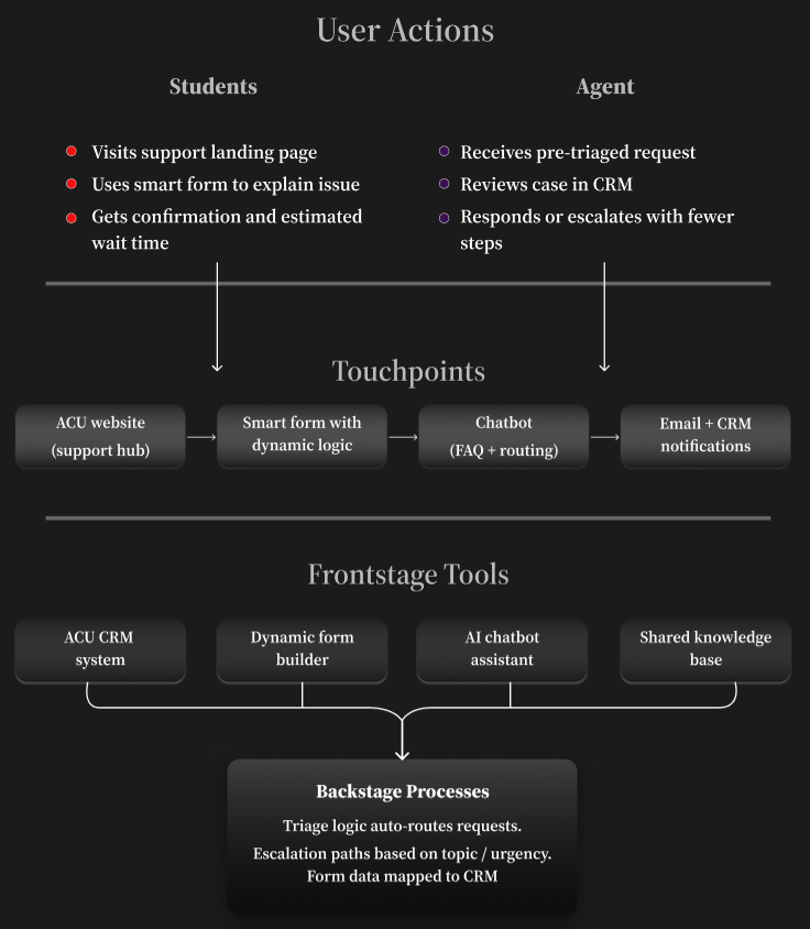
Mapping the Student and Staff Experience

The goal was to uncover patterns of confusion, repetition, and drop-off moments across channels.
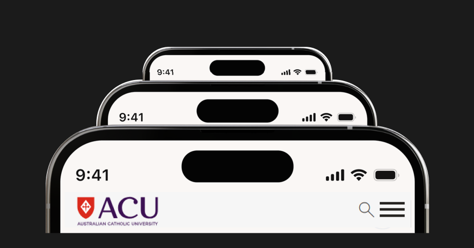
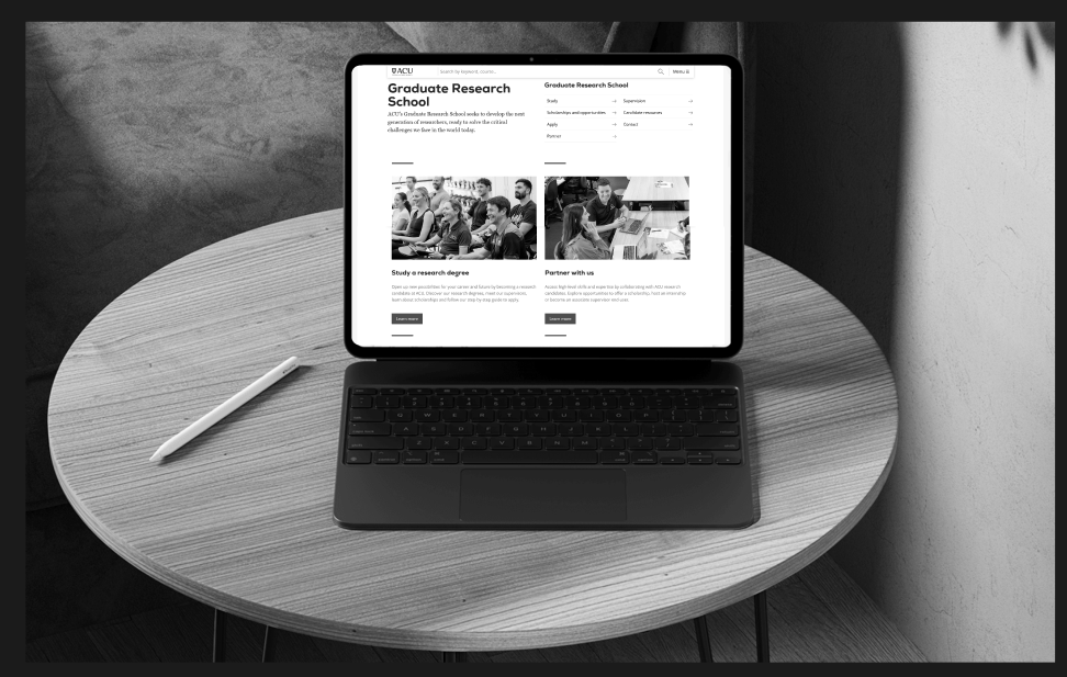
Blueprinting the future experience
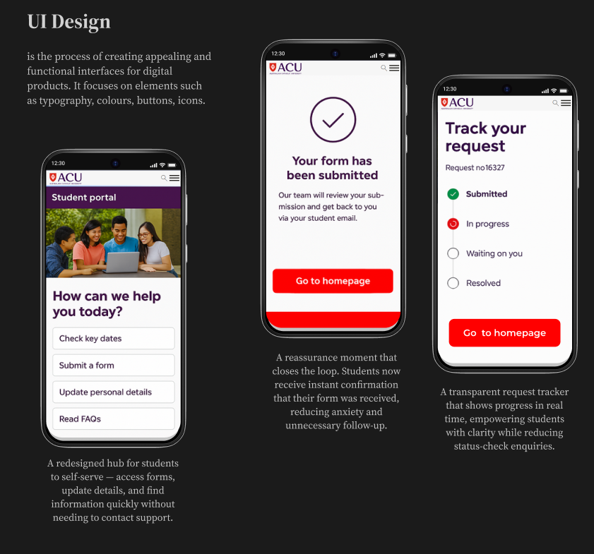
A redesigned support experience that connects students to the right help faster—using smart forms, triage logic, and simplified pathways.
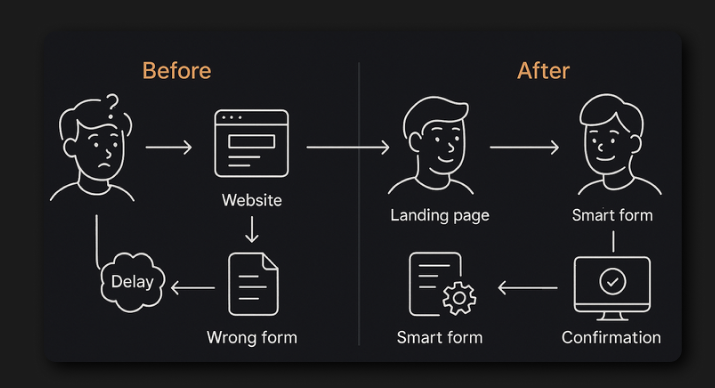
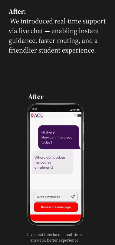
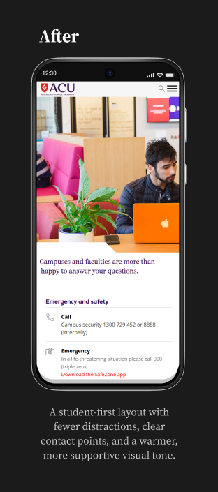
Redesigning the Experience: From Friction to Flow
These mobile-first prototypes brought clarity, confidence, and structure to a previously fragmented support journey.
From Chaos to Clarity: Results That Mattered
The redesigned experience didn’t just look better — it worked better. After implementation and testing:
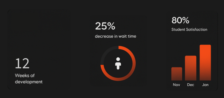
These outcomes came from ongoing testing with real users and lightweight analytics tracked via internal tools. They were gathered during post-launch testing and internal validation over a 3-month review cycle.
Final thoughts
Designing clarity in complexity—because great service starts with great systems.
Improving student support at ACU wasn’t just about designing cleaner pages—it was about rethinking how help is delivered at scale.
By combining research, system mapping, and AI-enhanced service flows, we created a more intuitive, responsive, and human-centred experience for both students and support agents.
What made this project meaningful wasn’t just the technology—but the outcome: less confusion, faster support, and a calmer, more confident student journey.
This case reaffirmed my belief that great service design lives at the intersection of clarity, empathy, and systems thinking.